PlanIt - Travel Planning App
ROLE
Product Designer
Type
Self-initiated & Validated with 5 real users
TIMELINE
~ 6 weeks
Jun - Jul, 2025
Skills
End-to-end UX/UI Design Process
Design System
01. OVERVIEW
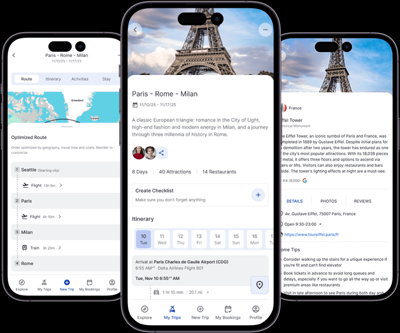
The average traveller switches between 5+ apps to plan a multi-city trip and still feels unprepared. PlanIt is a self-initiated 6-week design project: a single planning layer that replaces the fragmentation, letting users organise cities, visualise routes, and build a flexible itinerary before committing to any booking.
How might we help travellers plan complex multi-city trips with confidence and flexibility before committing to any bookings?
02. RESEARCH
User interviews + competitive analysis of 5 travel apps surfaced eight consistent themes. Four shaped the design directly.
Planning is personal
Users want ownership of the plan and automation is welcome only when they stay in control.
City ordering has a mental model
Users sequence destinations by geography, weather, and energy levels but need map context to reason through it.
Fragmentation is the #1 frustration
Users switch between 5+ apps with no connective tissue between decisions. The tools create the stress.
Users want a skeleton, not a script
Rough structures and smart suggestions is welcomed. Locked schedules and over-automation is a big no.
“I use Google, Maps, a spreadsheet, WhatsApp, and three booking sites and I still feel like I'm missing something.”
- Jessal, 30
Every competitor solves one slice in isolation. Wanderlog comes closest but its depth creates a steep learning curve and key features sit behind a paywall.
The gap: no tool combines unified multi-city planning + transparent route logic + AI assistance that respects user control in one experience.
Flight search was descoped from v1. Strong incumbents (Google Flights, Skyscanner) already own that space. PlanIt's leverage is the planning layer before booking.
03. DEFINE
Two personas anchored every decision not as demographic profiles, but as behavioural lenses.
Chetan
The Structured Planner
28 · Software Engineer · India
"If it's planned well, the trip feels effortless."
Owns the plan end-to-end. Wants full visibility, optimised routes, and group input without losing coherence.
Molly
The Flexible Co-Planner
32 · Teacher · United States
"I like a plan, but I go with the flow when adventure calls."
Builds a skeleton and adapts. Values quick group consensus and room for spontaneity within a trusted structure.
Optimised for Chetan. Ensured Molly isn't treated as a passive collaborator. She's an active co-planner who needs flexibility within the same core experience.
How might we give users a single, trusted space to plan a multi-city trip without switching between apps?
How might we make route and city ordering feel visually grounded so users can reason spatially, not just logically?
HMW help planners stay confidently on top of bookings, decisions, and changes without relying on memory or scattered communication?
HMW help planners choose stays that align with group needs (comfort, food preferences, location) with greater confidence and fewer compromises?
04. DESIGN DECISIONS
Four decisions shaped the product, each grounded in research, each trading something off.
Routes as first-class objects
City order affects everything downstream - cost, stay duration, daily schedule. Making it the first decision, not the last, was the core design act.
Trades simplicity of a linear flow for user confidence.
Smart sequencing with visible logic
Users trust automation only when they understand it. Surfacing the reasoning (geography, efficiency) makes it feel like a collaborator, not a black box.
Adds some visual complexity to the ordering screen.
AI as assistant, never gatekeeper
Trust in automation is conditional. Past negative experiences (Google Trips) mean users need to feel in control at every step.
Slightly more interactions on some flows.
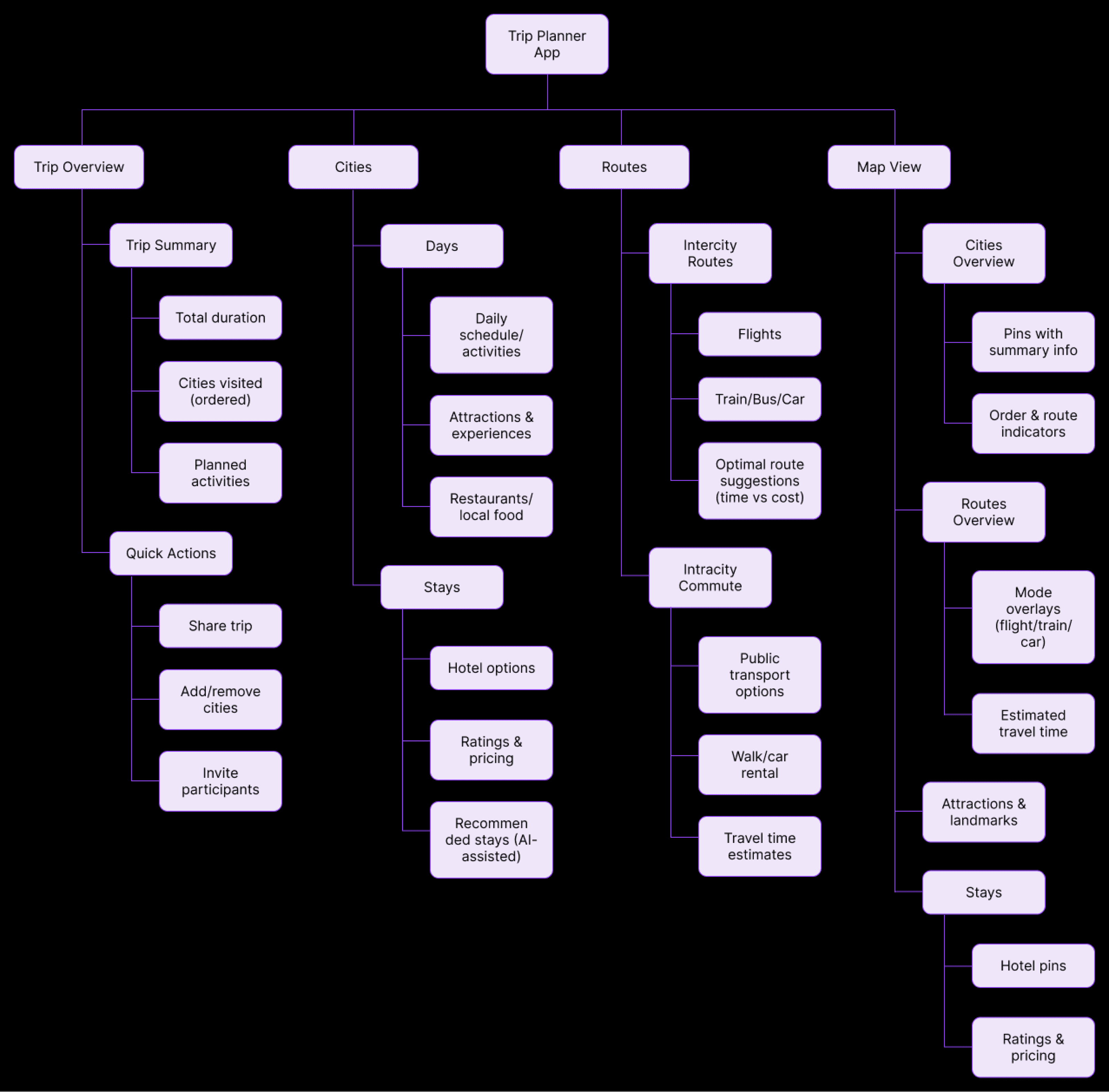
IA around objects, not pages
Trip → Cities → Days → Activities → Stay mirrors how users actually reason. Stays live per-city because that's how users think about accommodation, not globally.
More complex data model under the hood.
IA diagram label:
05. PRODUCT
Visual-first. Each screen is a planning decision made visible.
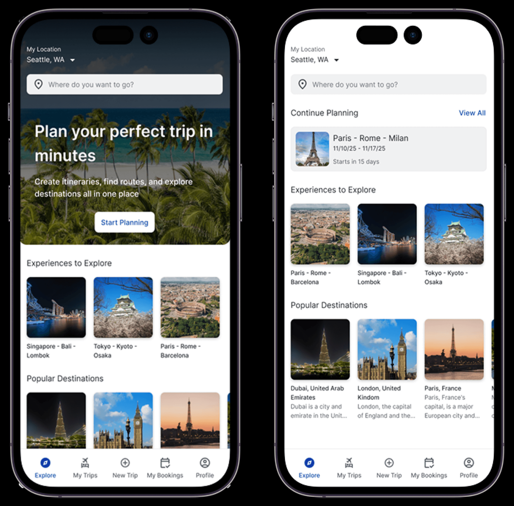
Home
The home screen balances inspiration with action. Two intentionally different states, new users need orientation, returning users need momentum.
Trip creation
The entry point keeps commitment low. Dates are optional at this stage planning shouldn't require a decision you're not ready to make.
Route logic is surfaced before the itinerary because city order affects everything downstream. This is the most important decision in the planning flow, not an afterthought.
Added visible logic that builds trust -
"Order optimised by geography, travel time and cost. Reorder to customise."
Users can override the suggested order at any time. The system explains its reasoning, users decide whether to follow it.
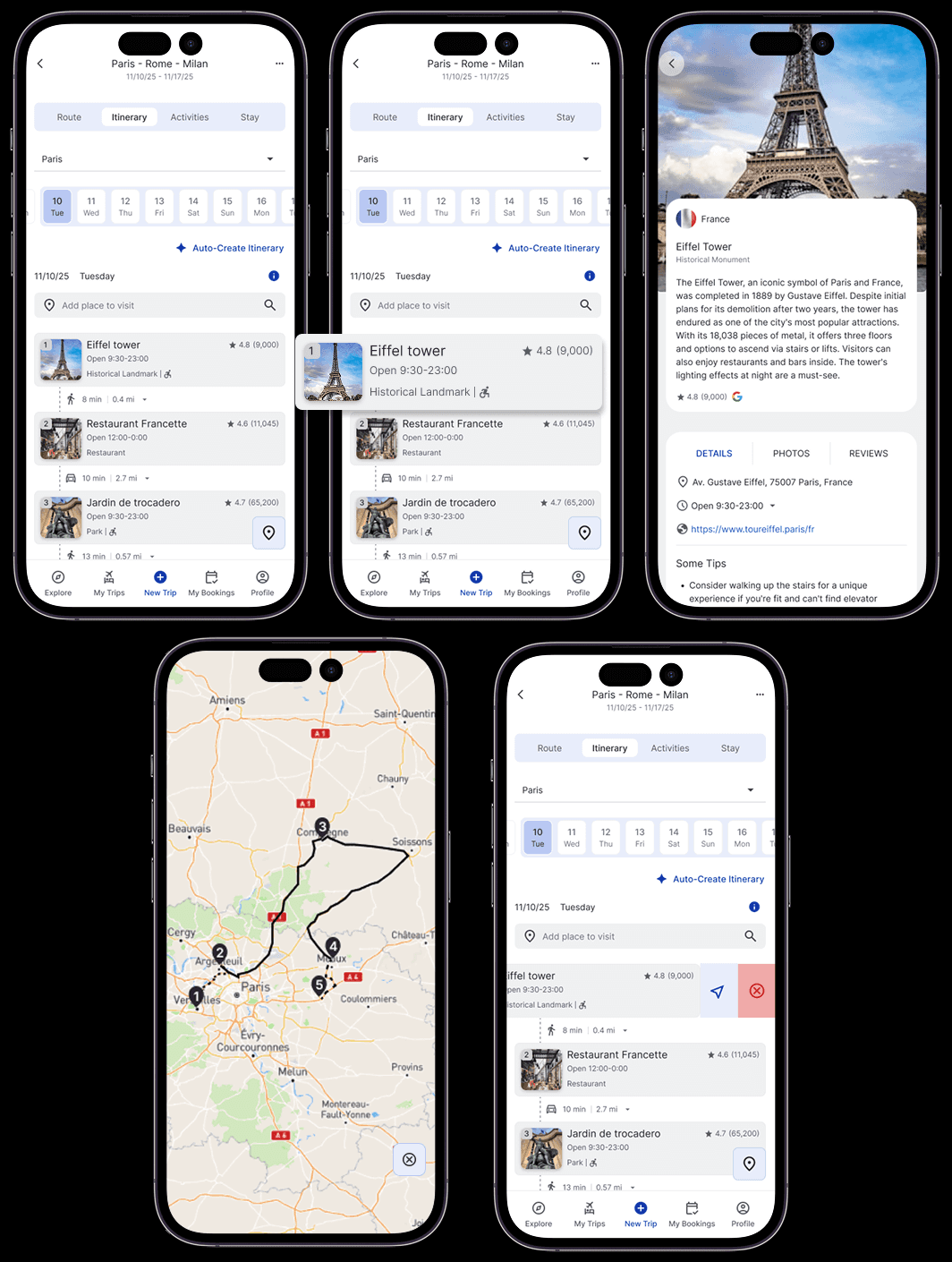
Itinerary
Auto-Create provides a skeleton, not a prescription. Users start with something instead of a blank page and then make it their own.
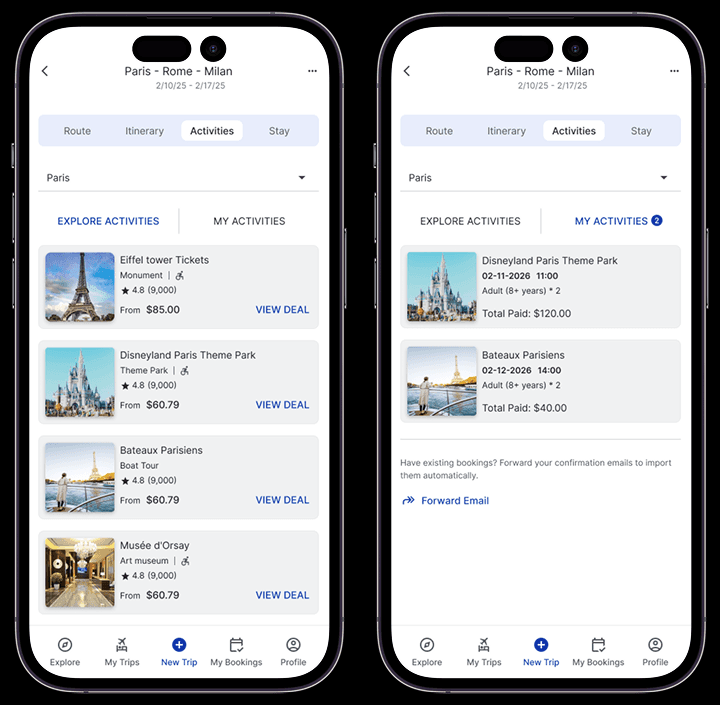
Activities
Discovery stays contextual to the trip. Every selection feels like a planning decision, not an impulse purchase.
Smart Stay
Recommendations are surfaced contextually - pre-filtered by city and dates already in the itinerary. Bookings defer to third-party platforms, keeping Plan It focused on planning, not conversion.
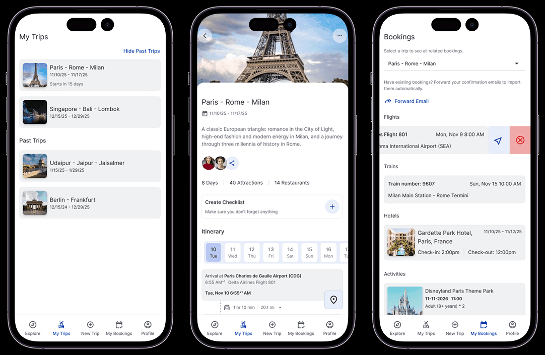
My Trips + My Bookings
Two hubs that answer the same question from different angles "where am I with this trip?" and "what have I confirmed?"
One source of truth, no app-switching.
06. VALIDATION
Moderated remote sessions with 5 real users. Scenario-based tasks, think-aloud protocol, SEQ per task, SUS post-session.
95.83%
Avg. task completion rate
Target ≥ 80%
6.38 / 7
Avg. SEQ score
Higher = easier
93.5
Avg. SUS score
Industry average = 68
Users understood trip structure and city relationships without prompting.Editing flows felt safe, users explored without anxiety of breaking anything.The planning vs. booking boundary was clear and trusted.
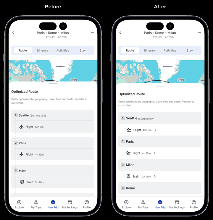
Before / After 01 - Route screen
Before:
Route card felt static. Users didn't know it was interactive or switchable.
After:
Refined component communicates interactivity clearly, improving confidence in modifying the route.
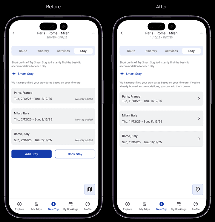
Before / After 02 - Stay screen
Before:
Dual "Book Stay" + "Add Stay" options created decision ambiguity.
After:
Consolidated into a single 'Add Stay' flow within each city which removes ambiguity, reinforces planning focus.
07. REFLECTION
Research → Design Traceability
Every decision traces to a specific insight. No feature exists without a user problem to justify it.
Systems thinking
The trip is an interconnected object - routes affect stays, stays affect days, days affect the map.
Judgment on scope
Deliberately deferred flight search and collaboration flows. Focused on designing the MVP.
Comfort with iteration
The IA evolved during wireframing - a deliberate decision, not a gap. Good design changes as understanding deepens.
If this product were taken forward, the next phase would focus on:
Stress-testing complex itineraries with overlapping transportation modesIntroducing collaborative planning once solo planning is fully validatedExplore cross-platform expansion to tablet and web for desktop plannersDeepen Smart Stay personalization with preference learning over time