Big Ideas Learning
Building the platform a new curriculum was sold on

ROLE
Senior UX Designer (led UX)
TEAM
Product Manager, 2 UX Designers, Engineering
TIMELINE
8 months design (Sep 2023–May 2024) · 10 months development
SCOPE
MVP, end-to-end
In compliance with this project's NDA, proprietary screens and internal documentation cannot be shared. This case study focuses on the design process, key decisions, and outcomes, with visuals reconstructed to illustrate the real flows.
OVERVIEW
10 months to ship or miss the school year window and a curriculum launch for 800K users was riding on the platform. Big Ideas Learning was selling school districts a brand-new K-12 math curriculum, in partnership with National Geographic Learning. One of its four pillars was an "Innovative Digital Experience" - core to the pitch, not a companion app. Zeus Learning was brought in to design and build it, and I led UX.
Problem
A teacher doesn't arrive empty-handed. By the time myADA Math entered the picture, the average teacher was running their day stitched across four disconnected tools. One to plan, one to present, one to grade, one to manage students. The constant switching meant high cognitive load and slow manual work, a productivity drag the platform had to fix.
Solution
I led the 0-to-1 design, replacing four fractured tools with one platform that adapts to the teacher's context.
Result
We shipped on time for the 2024–25 school year - the full teacher workflow, end to end, for ~ 800K teachers and students. It reached final sign-off with zero major revision requests. And the design system left the team roughly 30% faster across flows than where we started.
PROBLEM
A teacher's day was stitched across four tools - one to plan, one to present, one to grade, one to manage students. myADA Math had to collapse all of that into one coherent platform.
The real challenge wasn't building features. It was making a system complex enough to run an entire school year feel simple enough to use on day one.
Goals
Launch: Ship a baseline MVP in time for the 2024-25 school year: a minimal, coherent feature set that could be built, tested, and shipped within the build cycle.
Usability: Consolidate four disconnected tools into one platform that simplifies the complex workflows teachers and students were juggling.
Scale: Stand up a design system that could support future features and iterations efficiently.
PROCESS
Competitive analysis
I audited three established LMS platforms - Canvas, Moodle, and Google Classroom to map what teachers already expected. The goal wasn't novelty, it was meeting muscle memory. Applying Jakob's Law, I kept core conventions intact to keep the learning curve low.
Scope definition
Before any design, We ran a cross-functional workshop with BIL's team, teachers, PMs, UX, engineering to lock what the MVP had to do. We left with a prioritized list. Deciding what not to build is what kept the MVP shippable in 8 months.
Teacher interviews
I worked with a few core teachers throughout, plus others ad hoc. I went in with a two-mode assumption - Plan (a standalone teacher workspace) and Present (for the classroom screen).
Teachers validated both, then asked for something I hadn't planned: a way to see exactly what students would see before pushing content live. That became the third mode - Student Preview.
It was an easy call to include: structurally it mirrored the student-facing experience we were already building, so it added real value for teachers at little extra cost.
Must Have:
Onboarding
Manage Class
Manage Student
Course Player + Nav
Assignment Workflow
Assignments Center
Content Presentation
Student View + Nav
Item Analysis Report
Gradebook Report
Should Have (Post MVP):
Integrations (OneRoster, Clever)
Content Customization
Lesson Progress Report
Evaluation & Grading
Could Have:
Dashboard
Additional Assignment Features
Won't Have:
Personalization
Course Themes - Grade Band
Information architecture
Talking to teachers, one thing was clear: they think by class, by student, by assignment, so I structured the platform the same way, not around how the data sat on the backend. Getting the skeleton right early meant every later decision had something to refer back to.

Whiteboarding & user flows.
I sketched flows per module on paper. Each flow doubled as the feasibility checkpoint devs and I pressure-tested technical reality before anything moved to high-fidelity.
Design system
A scalable design system was a goal from day one, this platform was built to grow. I led the library in Figma, two designers contributing, and engineering built custom React components from it. Because development needed the admin layer first, the earliest modules were coded before those components existed - an unintended but telling gap: modules built after the component library carried roughly 15% fewer UI defects than the earliest ones built before it, flagged by our QA lead in retrospective. Shared components also drove ~30% faster team velocity across the remaining flows.

High-fidelity
With a tight timeline and parallel flows, the design system let screens move fast without drifting.
A constrained decision
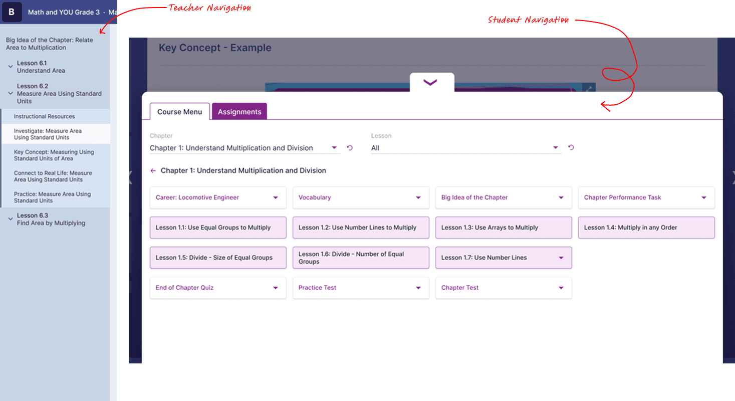
While building the hi-fi student mocks, the first versions mirrored the teacher nav. Stakeholders intervened, they wanted the student experience to follow a legacy structure that had a proven track record. With no direct student research to justify a different call, I deferred to the proven pattern and modernized it visually. Engineering pushed back on the added build cost; the estimate for the student view grew, and we absorbed it.
Feedback & incorporation
Because stakeholders and teachers were in the loop throughout, sign-off was clean. The one real pushback came on the Item Analysis report. Stakeholders wanted the pie chart patterns stripped for a cleaner look. I flagged it as a WCAG 1.4.1 issue: color alone can't carry meaning. I offered to explore alternative patterns, but once the team understood the accessibility rationale, the originals stayed.
SOLUTION
1/3: Three modes, one platform
Insight: the platform should adapt to the teacher's context, not the other way around. I went in with two modes; the teachers handed me the third.
Same platform, same data, three contexts - each focused on the job in front of the teacher at that moment.

Plan: the teacher's workspace to prepare, organize, and assign content.

Present: built for the classroom monitor. Larger type, scaled content, admin controls out of view.

Student Preview: a read-only view of exactly what students see. Teachers asked for it as a way to check their setup before pushing content live.
2/3: Reports readable in 30 seconds
Insight: teachers need one question answered fast, not a dashboard to explore. Two reports, two jobs: the Gradebook gives a class-level read of who's keeping up and who's slipping; Item Analysis goes a level deeper, surfacing which specific questions students keep missing, the signal that changes what a teacher does in class tomorrow. Both were designed to be read in under 30 seconds. If a teacher has to study a report to understand it, the report has failed.

Item Analysis Report

Gradebook Report
3/3: Class & student management: the foundation everything sits on
Insight: nothing works until the roster does. Before a teacher can assign a course, the classes and students have to exist in the system so this admin layer was built first. Working from a session with BIL's internal admins and input from teachers, I designed two ways to populate it: manual creation for one-off setup and CSV import for bulk, both built to stay compliant with COPPA and FERPA, since we were handling K-8 student data. Classroom creation followed the teachers' real setup flow.

Class Listing

Class Creation

Student Listing

Student Creation
HANDOFF
The design system was the handoff artifact - engineering assembled from a shared library rather than translating static comps. I wrote user stories for every flow ("As a teacher, I should be able to [action] so that [outcome]"), answered dev queries on Jira through the build, and ran design reviews on developed modules before stakeholder sign-off. Feasibility wasn't a final-stage surprise it was checked at the flow stage, module by module.
OUTCOME
The MVP shipped July 2024 for the 2024–25 school year, on time, covering the full teacher workflow: onboard, set up a class, assign a course, teach, assess, read results. Students got a clean, distraction-free experience.
~800K
students and teachers
30%
faster team velocity from the design system
0
major revision requests at sign-off
This case study covers the MVP. I stayed on the platform through Feb 2025, designing post-launch features and folding in teacher feedback as it scaled.
REFLECTION
Listen for the mode you didn't plan
I came in with two modes. Teachers gave me the third - Student Preview. The best part of the design came from listening, not from my assumptions.
A design system earns its place in the defect count
We set out to build one, and dev timing handed us the proof, the modules built on the system measurably outperformed the two built before it landed.
Know where you've earned an opinion
I designed the teacher experience from research. For the student side, I had no data, so deferring to a proven pattern was the right call, not a defeat.
what I'd do differently
We built the student experience from teacher and stakeholder input, solid proxies, but still proxies. A few sessions with actual students early on might have given us the ground to push back on the legacy nav instead of deferring to it.