Twig Science
Closing a competitive gap by rethinking how teachers read a classroom
ROLE
UX Designer: Research, IA, Interaction Design, Visual Design
TEAM
Product Manager, Engineering
TIMELINE
2 weeks (Feb, 2022)
SCOPE
Sole designer, end-to-end
In compliance with this project's NDA, proprietary screens and internal documentation cannot be shared. This case study focuses on the design process, key decisions, and outcomes, with visuals reconstructed to illustrate the real flows.
OVERVIEW
Five weeks after kickoff, the feature I designed was being cited by name in competitive RFP evaluations.
Twig Science is a K-8 phenomena-based science curriculum platform serving 1M+ students. Teachers assign science assignments but had no way to see how students were doing in real time while the class was still in session.
It shipped with zero design revisions during development, and a QA process I introduced caught 12+ issues before the client saw the product, including a keyboard navigation break that would have shipped undetected.
PROBLEM
The PRD framed two problems:
For the business: Twig was losing RFP evaluations. Competitors like Edulastic, Nearpod, and Formative all had live monitoring. Twig didn't. Sales flagged it as a direct blocker in competitive deals.
For teachers: no way to see which questions students are stuck on during an active assignment. By the time results were available, the class had moved on.
PROCESS
Understanding the brief
The PRD defined two problems: teachers had no real-time visibility into student progress during active assignments, and Twig was losing competitive evaluations because of it. After reading through the requirements, the PM, tech lead, and I sat down together to discuss how to approach it - scoping the technical reality, aligning on what "live" actually meant in practice, and identifying where we had room to make design decisions versus where the constraints were fixed.
Competitor analysis
I audited Twig's direct competitors - Edulastic, Nearpod, and Formative and built a feature matrix mapping their live monitoring capabilities. Every competitor showed what students answered. None of them made it easy to see where the class was stuck at a glance. That gap became the design opportunity.

Talking to teachers
I joined 2 client calls to speak directly with teachers. These weren't formal usability sessions; I'd ask a question, whoever was on the call would respond, and I'd follow up based on what they said. The format was conversational, but the insight was consistent: by the time teachers reviewed assignment results, the teaching moment had passed. They didn't need more data after class. They needed the right information during it.
"By the time I grade assignments after class, it's too late to help the students who were struggling."
Two concepts, two information architectures
Based on the research, I designed two mid-fi concepts with fundamentally different structures:
Concept A: Student-first. Each student gets a card showing their full progress - status icons, scores, and answer previews all in one place. To find a class-wide pattern, you scan across cards. All the data is there, but it's organized around the individual.
Concept B: Question-first, unified view. A single grid with students as rows and questions as columns. Every cell shows live status, exact scores, and answer thumbnails together. All the data is visible in one scrollable screen.


I brought engineering in at this stage to pressure-test feasibility. The main constraint they flagged was a 2–5 second lag on live answer data which meant the design couldn't rely on real-time answer content as the primary signal. Status icons and scores would update faster than full answer previews.
Testing with teachers
I validated both concepts with 3 teachers through prototype walkthroughs on client calls.
Question-first won immediately. A column going red across six students is a re-teach signal in two seconds. Clicking into six individual student cards to find the same pattern isn't how teachers work mid-class.
But the unified view had a second problem: too much information competing for attention. One teacher put it directly - can we have the percentages and the live view separate?
That was the progressive disclosure signal. Teachers had three questions, and they asked them in sequence, not simultaneously: Is everyone on track? What are the exact scores? What did they actually write? Forcing all three into one view meant none of them worked well.
Feedback - From one view to three tabs
The teacher feedback led directly to the three-tab structure:
Summary: status icons only. The fastest possible read. Is everyone on track?
Details: same grid, icons replaced with scores. Toggle between absolute and percentage. How did they actually perform?
Answers Preview: thumbnail cards of student responses. What did they write?
Each tab answers one question. Teachers choose the depth they need at the moment they need it. The 2-5 second lag on answer data reinforced this split - Summary and Details could update near-instantly with status and scores, while Answers Preview could tolerate the slight delay since teachers accessed it deliberately, not at a glance.

Stakeholder sign-off
I presented the refined three-tab design to stakeholders. The decision was grounded in teacher feedback, so the rationale was clear - sign-off was straightforward.
After approval, handoff to engineering began.
SOLUTION
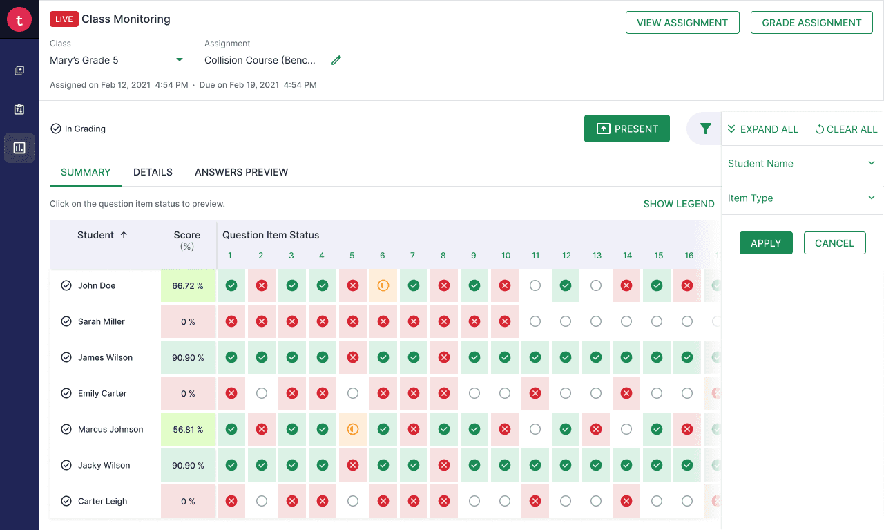
Summary: is everyone on track? Color-coded status icons across a question-first grid. One glance answers the question.
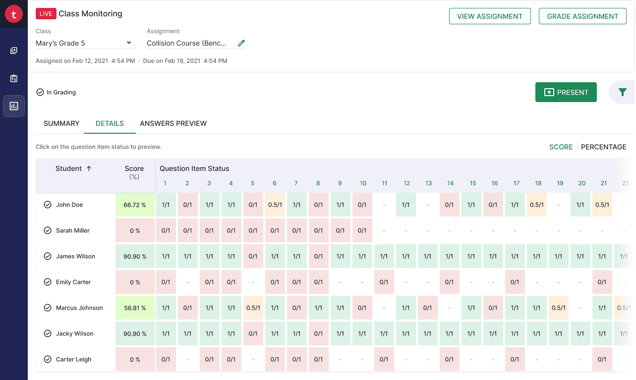
Details: exact scores. Same grid, icons replaced with fractions. Toggle between absolute and percentage. Same layout, deeper data.

Answers Preview: what did they actually write? Thumbnail cards with live student responses. Only available during In Progress because that's when it matters.

Preview Modal: clicking a cell shows all student responses to that question, not all questions for one student.
HANDOFF
Engineering was embedded in design reviews from week one, pressure-testing decisions, not waiting for a handoff deck.
I wrote granular user stories: "As a teacher, I should be able to [action], so that [outcome]."
I ran bi-weekly design reviews during the build phase. We caught 12+ issues before the client ever saw the product - spacing deviations, wrong font weights, and one that mattered most: a tab order break that sent keyboard focus past the main content area entirely, breaking navigation for assistive technology users. It would have shipped undetected.
OUTCOME
Within a month of launch, Live Class Monitoring was being cited by name in competitive RFP evaluations. A feature that didn't exist five weeks earlier became a sales differentiator.
I rolled off the project one month post-launch. Post-launch analytics stayed with Twig Science. The qualitative signal in that first month was positive, and the sales confirmation was concrete.
100% design fidelity
from spec to build
0 revisions
during development
12+ issues caught
pre-launch during design review
Success criteria I'd track post-launch
Feature adoption rate
% of teachers who used Live Monitoring on at least one In Progress assignment.
Per-assignment activation
Did teachers open during In Progress or only after grading? This was the core test of whether the design served the right moment.
Retention by cohort
Did teachers come back for subsequent assignments, or was it a one-time open?
REFLECTION
Let users show you where the seams are
I didn't plan 3 tabs. I planned 1 view that showed everything. Teachers showed me that "everything at once" isn't clarity - it's noise.
Build the review process, not just the design
The bi-weekly design review loop caught a keyboard navigation break that would have shipped undetected.
Let the technical constraint sharpen the design
The 2–5 second lag on answer data could have been a problem. Instead it validated the tab split - fast data in Summary, deliberate access in Answers Preview.